

Project Summary
As the Lead UX Designer, I was responsible for research, design, and strategy to revamp the UX of SimpleEvents, a B2B and B2C event management platform. The goal was to streamline workflows, reduce friction, and increase efficiency for both internal teams and clients.
Objectives:
Automate repetitive tasks to save time and reduce errors.
Simplify the event planning process to improve user satisfaction and engagement.
Identify opportunities for new features to scale the platform effectively.
Problem
SimpleEvents struggled with low user engagement and inefficient workflows. Both employees and clients found the platform difficult to navigate, resulting in errors, delays, and frustration during event planning, promotion, and production.
Key pain points:
Only 25% of event planners completed setup without errors.
Internal teams spent excessive time navigating complex workflows.
Clients also faced difficulties planning and executing events efficiently, which negatively impacted overall satisfaction.
Results
The redesign delivered measurable improvements across the platform:
30% increase in task completion rates, improving efficiency and reducing frustration for both teams and clients.
40% reduction in friction points, streamlining workflows, and making processes more intuitive.
Enhanced information architecture, improving findability and speeding decision-making.
Higher user satisfaction scores, reflecting more intuitive interactions and a smoother overall experience.
Key Platform Decisions
-
Implementation:
I reorganized the platform’s content hierarchies, established consistent visual cues, and reduced the amount of information per page. These changes simplified navigation, improved task flow, and lowered cognitive load for users.Rationale:
The original IA caused confusion, high memory load, and frustration. Clear hierarchies and consistent visual cues make the platform intuitive, enabling faster task completion and reducing errors. -
Implementation:
Reorganized content hierarchies and simplified navigation to reduce friction.
Improved search systems so users can find information quickly.
Applied clear typography, design hierarchy, labeling, and interaction feedback to guide users through the platform.
Rationale:
These changes reduce cognitive load, clarify workflows, and make the platform easier to learn and use, without removing any functionality. Users can now navigate efficiently, understand their current state, and complete tasks with confidence. -
Implementation: I introduced a personalized registration experience using a pull-out tray that collects key attendee information and tracks attendance in real time. This approach ensured smoother event management and more accurate data capture.
Rationale: Centralizing attendee data in an intuitive pull-out tray allowed event planners to easily capture and track information without disrupting key workflows, significantly improving efficiency. -
Implementation: The overview page layout was simplified to provide quick, at-a-glance insights, making it easier for users to manage event details and track progress.
Rationale: The streamlined layout helps users focus on high-priority tasks by reducing cognitive overload and presenting essential information in a digestible format. This led to better engagement, faster task completion, and improved user confidence.
How I Identified Key Issues
To ensure design decisions were evidence-based, I conducted a UX audit and heuristics evaluation. This involved mapping user flows, identifying bottlenecks in task completion, and uncovering friction points that were impacting both internal teams and clients.
I also performed a competitive analysis of similar platforms to uncover best practices and design patterns. This research helped identify gaps in SimpleEvents’ UI/UX and informed strategic improvements that could make the platform more intuitive and efficient than its competitors.

Information Architecture (IA) Improvements
The platform’s information architecture was a major source of user frustration. Users struggled to find information and complete tasks efficiently due to confusing navigation, weak visual cues, and excessive cognitive load. Improving the IA was crucial for making the platform intuitive and reducing errors in workflows.
Core IA Issues Identified:
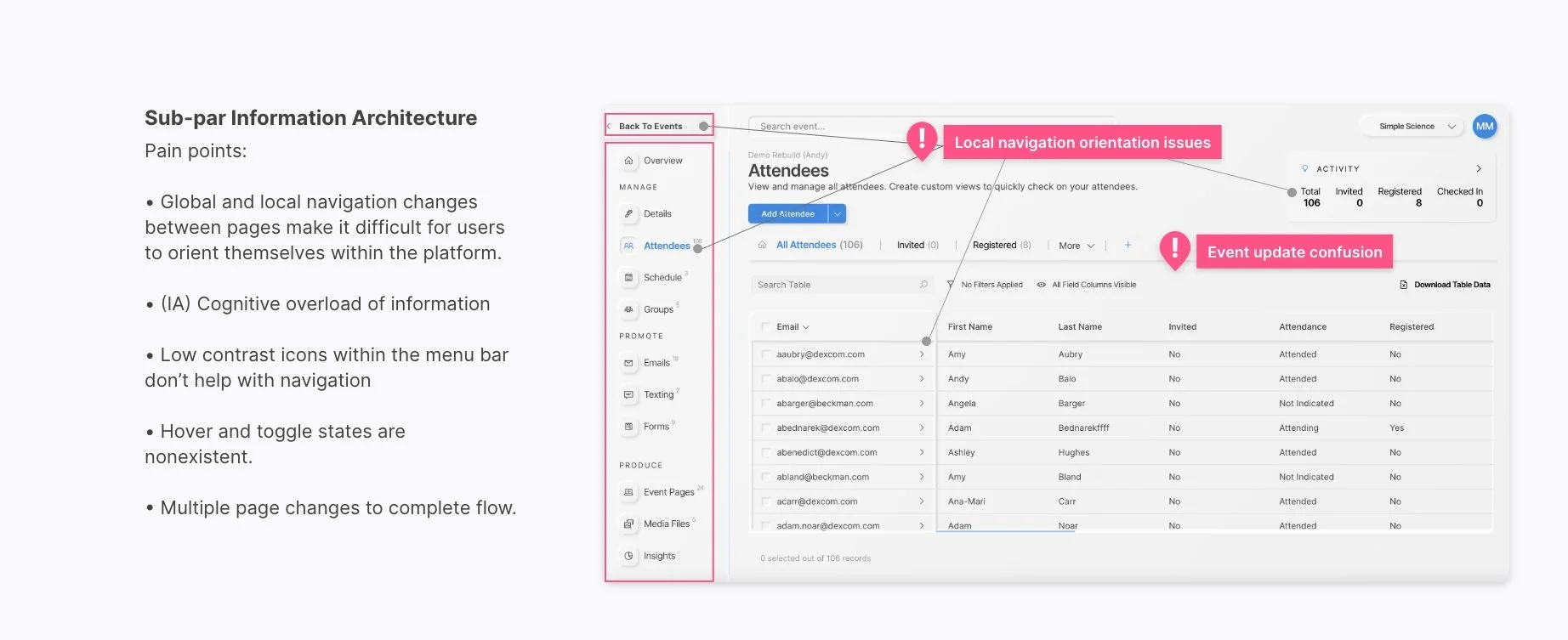
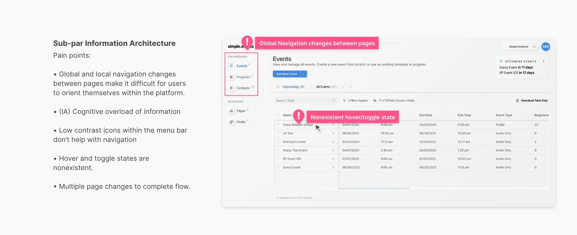
Confusing Page Navigation: Global, local, and secondary pages were unclear, causing users to get lost or take longer to complete tasks.
Weak Visual Cues: The lack of consistent design elements made it difficult for users to learn and navigate the platform effectively.
Excessive Cognitive Load: Pages contained too much information, forcing users to process and remember large amounts of content at once.
High Memory Load: Users had to remember details between tasks, increasing errors and slowing workflows.
I reorganized the platform’s structure by defining clear content hierarchies, establishing consistent visual cues, and reducing the amount of information users needed to process at each step. Annotated screens highlight the issues and show the improved layouts, demonstrating how these changes simplified navigation, reduced cognitive load, and made task completion faster and more intuitive.
Solutions
The main challenge was simplifying SimpleEvents without sacrificing its functionality. The goal was to build upon the existing platform, enhancing usability and streamlining workflows while maintaining the features that users relied on.
Based on research insights from the UX audit, heuristics evaluation, and competitive analysis, the solution focused on structural and visual improvements.
1.) Structural Improvements
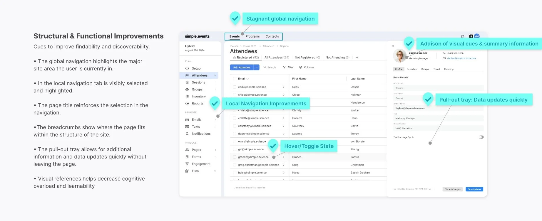
Information Architecture (IA): Reorganized content hierarchies to make navigation more intuitive and task flows more logical. Users could now find key information faster and complete tasks more efficiently.
Navigation Systems: Simplified movement through the platform to reduce friction and confusion, ensuring users could accomplish goals with fewer clicks.
Search Systems: Enhanced search functionality so users could quickly locate information, minimizing time spent searching and reducing frustration.
2.) Visual Improvements
Typography & Design Hierarchy: Introduced clear typography and visual hierarchy to guide users through tasks, reducing cognitive load and making important information easier to process.
Labeling Systems: Updated labels to be clear, concise, and intuitive, improving user understanding and confidence.
Visual UI & Interaction: Enhanced feedback mechanisms so users could immediately see their location within the platform, understand what actions they had completed, and know what to do next.
Together, these structural and visual improvements simplified workflows, reduced cognitive load, and made the platform easier to navigate. Annotated screens demonstrate exactly how the platform became more intuitive and efficient, while maintaining its full functionality.

Defining the Information Hierarchy
Information Hierarchy refers to the organization and display of content to ensure intuitive navigation and quicker decision-making. By prioritizing key elements and maintaining a logical flow, users can easily find what they need and complete tasks more efficiently.
The importance of information Hierarchy
Reduces Cognitive Load: A well-structured hierarchy helps users easily skim content and understand key points, reducing mental effort.
Enhances Engagement: When users can quickly find what they’re looking for, they engage more with the platform, leading to better interaction and longer usage.
Improves Task Completion: A clear hierarchy guides users toward their objectives more efficiently, whether that’s making a purchase, accessing information, or completing an event task.
UI/UX and Navigation Enhancements
Revamped the visual design—simplifying typography, layout, and visual cues—while streamlining task flows and reorganizing content to minimize cognitive load and improve usability across the platform.
Understanding the principles and best practices of Information Hierarchy is key to creating a great user experience. It acts as a guide, leading users effortlessly through the digital landscape and making it easier for them to find what they need.
-
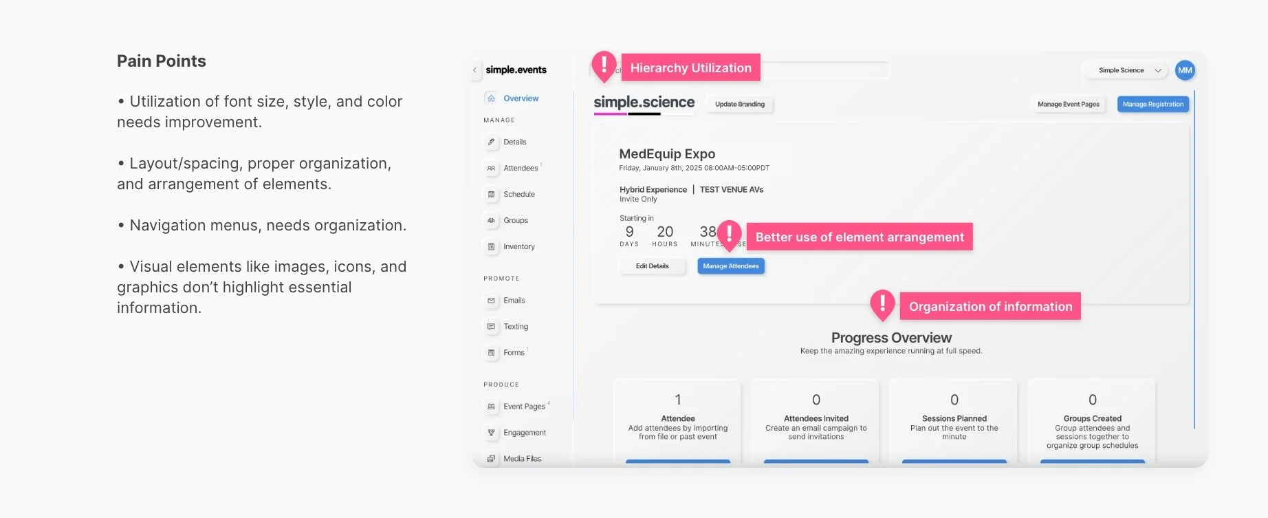
Typography plays a crucial role in creating visual contrasts between various levels of content. This is accomplished through the effective utilization of font size, style, and color.
-
Proper organization and arrangement of elements on a page helps create a sense of structure. Margins, padding, and alignment play a crucial role in guiding the reader’s eye.
-
Clear and well-organized navigation menus are essential for your website or app. They serve as guideposts, directing users to important sections.
-
Visual elements, such as images, icons, and graphics, play a crucial role in creating a visual hierarchy. They have the ability to highlight essential information and capture the viewer’s attention when necessary.
-
To ensure a smooth user experience, it is important to maintain a consistent hierarchy on your website or app.

Platform Start
The heuristic evaluation and redefined information architecture laid the foundation for the platform improvements. Key changes included streamlined user flows, improved UI design, and more intuitive navigation, making the event management process more efficient.
Additional Software improvements
In addition to the core UX improvements, I also contributed to optimizing the following areas:
-
Send automated, personalized emails to engage audiences, boost response rates, and increase attendance.
-
Build branded event websites with an easy drag-and-drop site designer and drive people to register.
-
Store your event data and calculate ROI, understand engagement, manage costs, and improve your event strategy.
Closing Reflection & Future of AI
This project was a great reminder of how even small structural and content changes—when based on real usability insights—can make a big impact. I used a hands-on, human-centered process for this redesign, but I’m also excited by how tools like AI are making research and heuristic reviews more scalable today. I think the future is in blending both approaches. Furthermore, SimpleEvents saw a measurable increase in user satisfaction and operational efficiency, setting a new benchmark for future product improvements.